Working as a 3D Motion Designer at Native Instruments, I’ve had the opportunity to
design visuals for a range of projects that reach and inspire the music production community.
My work includes community banners, visuals for products like VEA, Kontakt 7, Vocal Colors,
and the sibling instruments Schema Liaght and Schema Dark. Each project reflects a bit
of the brand’s character and my own approach to creating visuals that feel accessible,
engaging, and true to the essence of each tool.
I am very thankful for the privilege of having creative freedom in my work.
5 for 55
I designed the visual identity and promotional assets for Native Instruments’ "5 for $55" campaign, a limited-time offer allowing customers to choose any five Expansions for $55. My work focused on creating vibrant, engaging visuals that highlighted the campaign’s value and diversity, while ensuring a seamless user experience across digital platforms. This approach helped drive strong engagement and sales by appealing to a wide range of music producers.
Native Instrument's community visual language
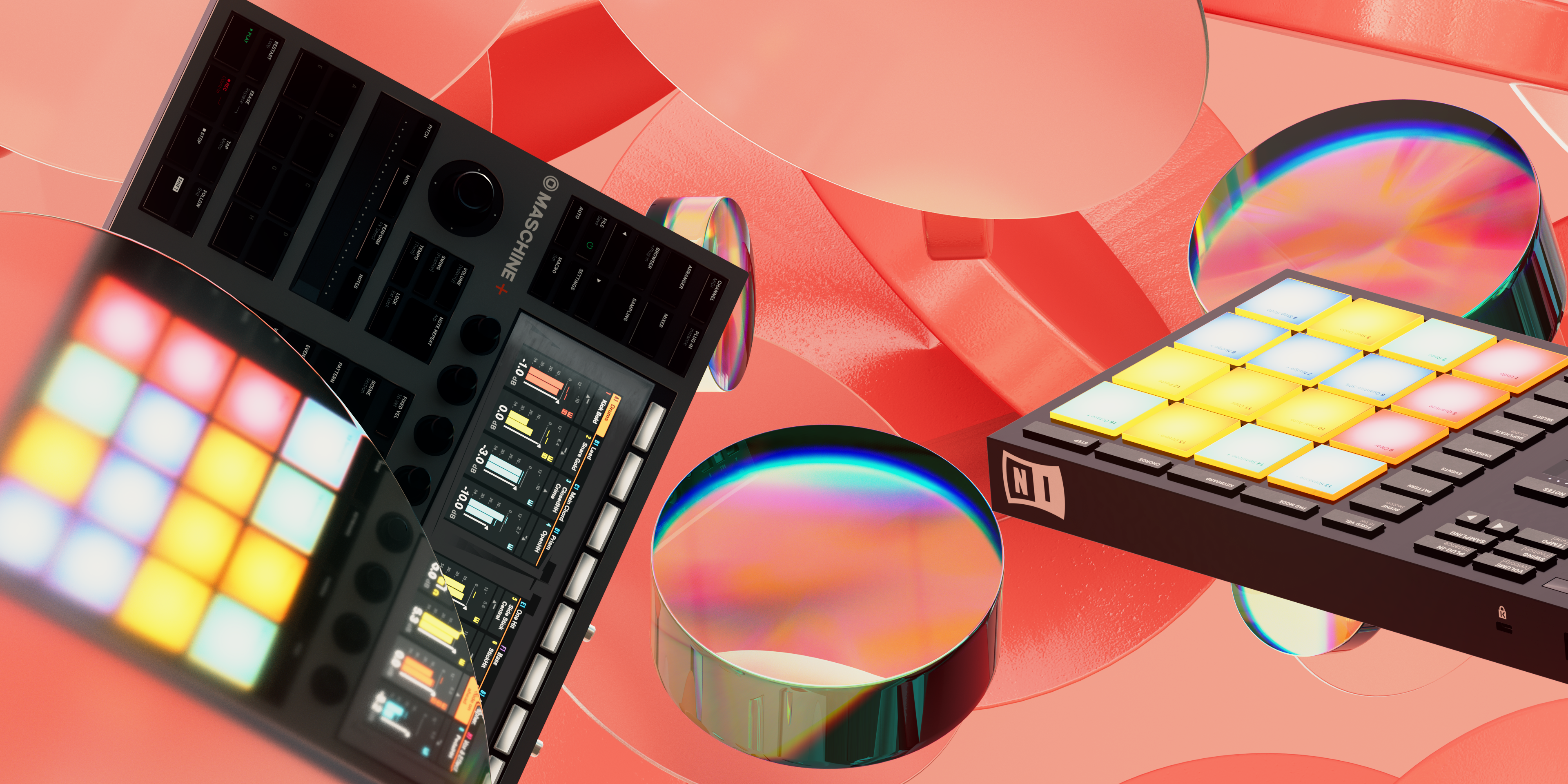
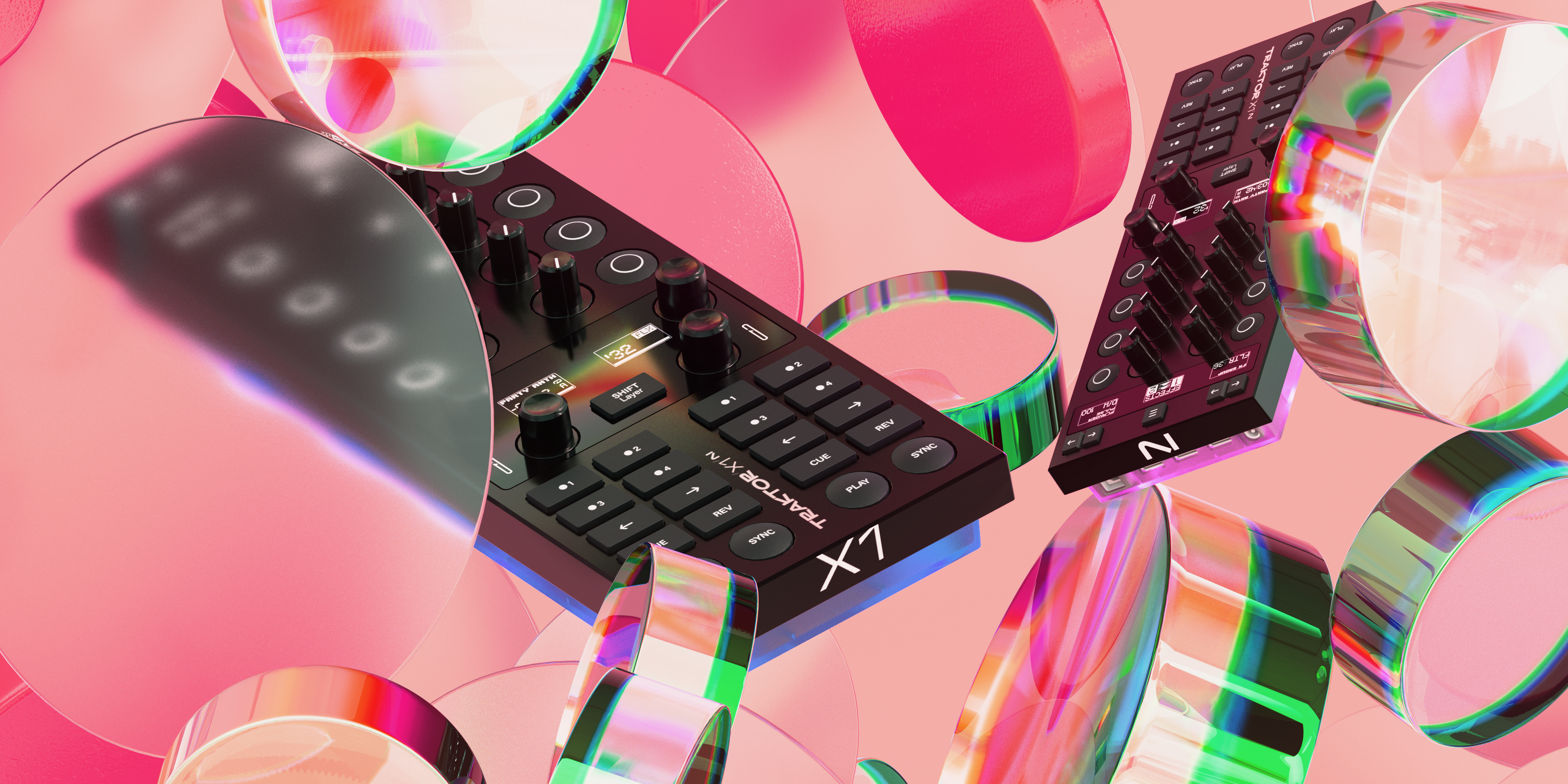
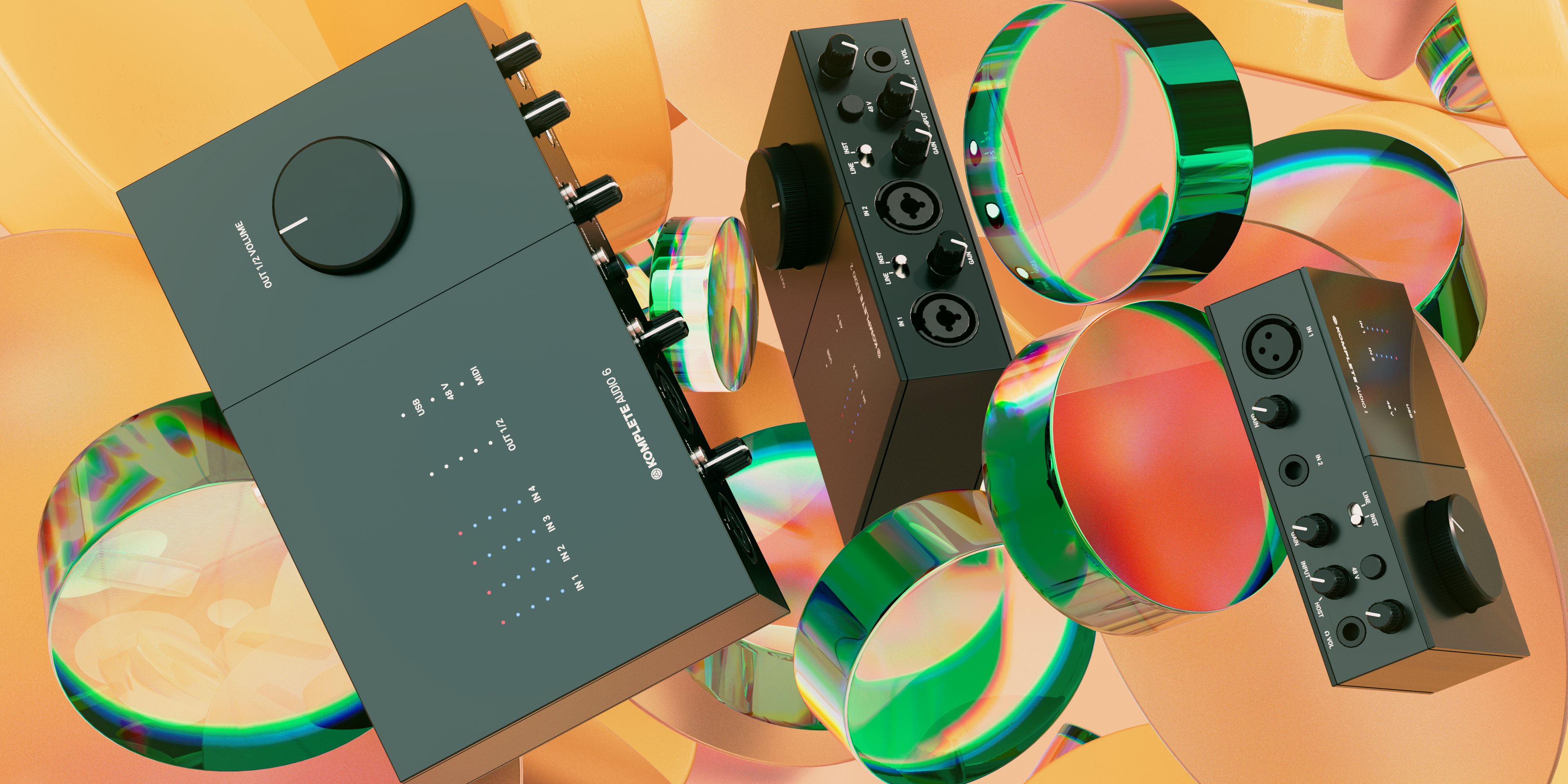
Native Instruments Community Banners - For the community banners, my goal was to capture the vibe of the Native Instruments’ online spaces—a place where creators can connect and find inspiration. I kept the visuals approachable and open, balancing between a creative and practical feel. Working with layered elements, a mix of textures, and versatile colors, I aimed to make each banner resonate with a variety of musicians, from beginners to seasoned pros. It’s about setting a welcoming tone and inviting people into a space that encourages creativity.

VOCAL COLORS pre roll video
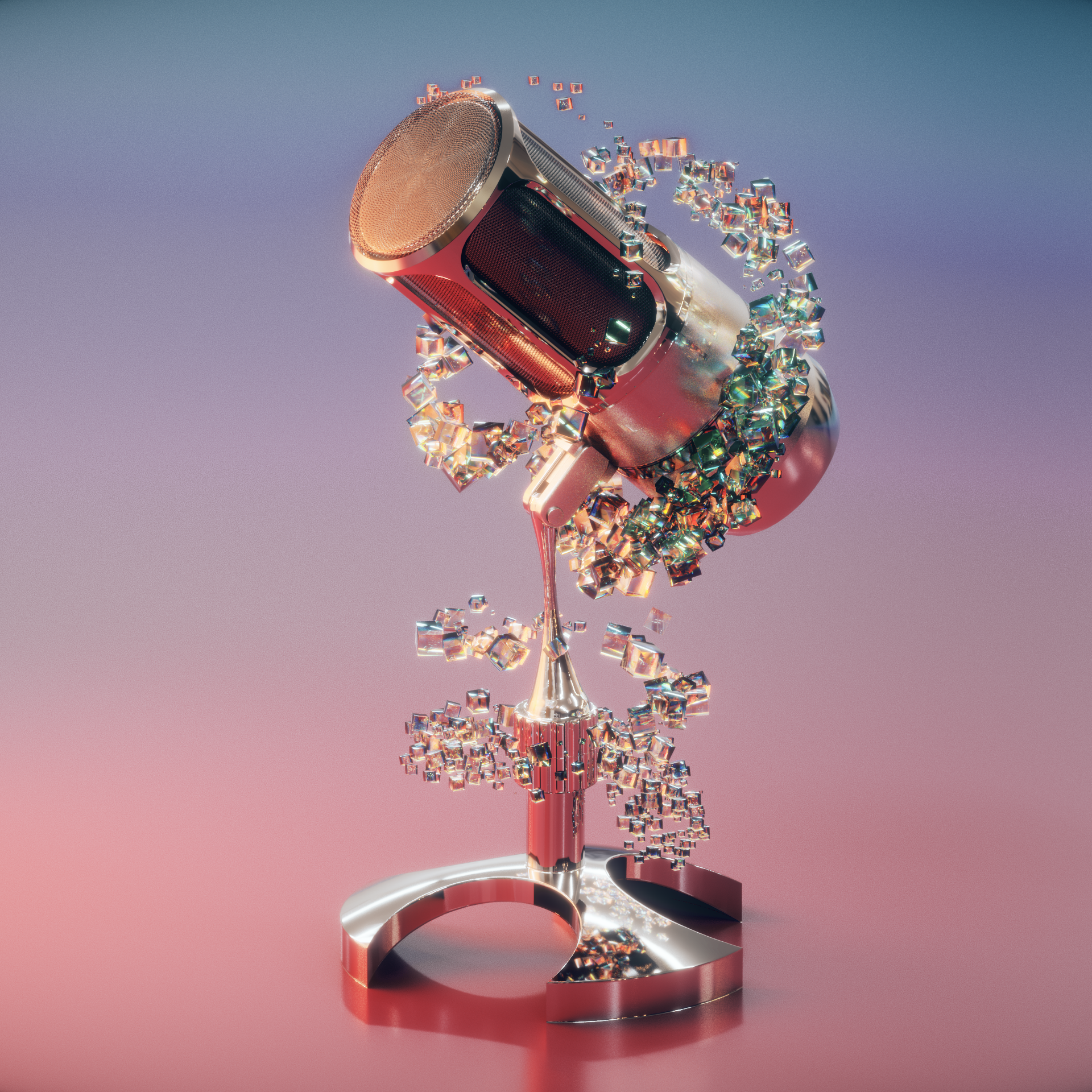
Vocal Colors is an expressive tool focused on the nuances and textures of vocal sounds, allowing users to explore vocal ranges with depth and variety. For this project, my aim was to reflect the organic, human feel of vocals. Using soft gradients, flowing shapes, and warm colors, I wanted the design to capture the dynamic and emotional aspects of vocal sound. The aesthetic is meant to feel fluid and inviting, guiding users into exploring the unique textures that Vocal Colors offers.
VEA pre roll video
VEA is a streamlined audio editing tool designed for clarity and simplicity, providing an efficient workflow for users. In creating visuals for VEA, I focused on a clean, minimalist approach to reflect its user-friendly nature. The design uses straightforward shapes and soft animations, making the interface feel as practical as it is engaging. My goal was to keep it intuitive and inviting, emphasizing functionality and keeping the visuals as clear as the tool itself.
Example of use in campaign - VEA introduction video
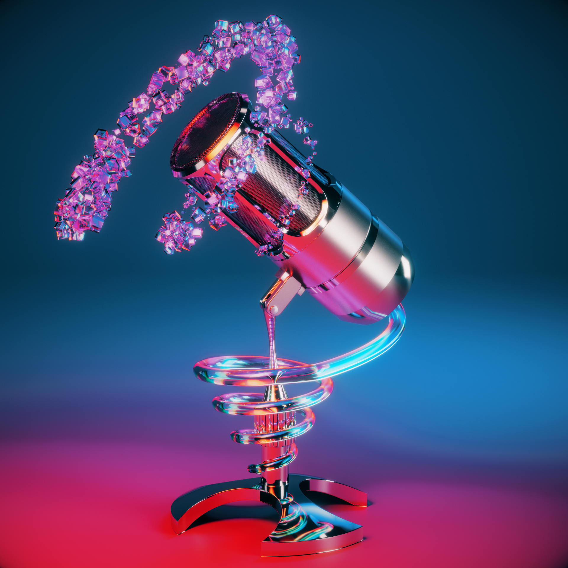
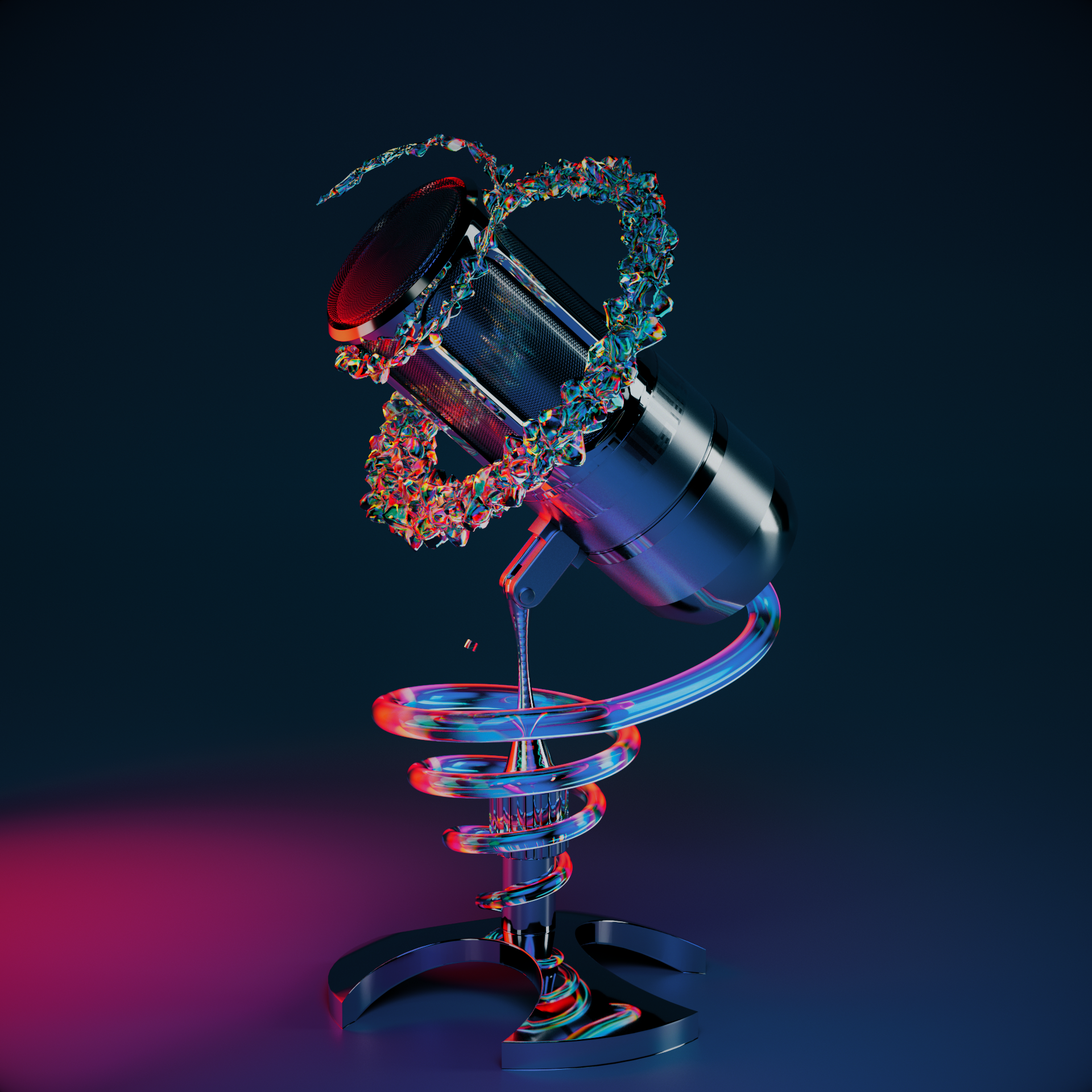
Some drafts that were left behind



KONTAKT 7 preroll video
Kontakt 7 is Native Instruments’ flagship sampler, known for its extensive library and flexibility in sound manipulation. Given its reputation and versatility, I aimed to give it a clean, professional look that maintains familiarity for long-time users while introducing a refreshed, modern feel. The design prioritizes clarity and ease of navigation, with an understated aesthetic that respects its legacy while keeping it approachable for new users and seasoned producers alike.
Video assets used for 'What's new in KONTAKT 7' campaign video
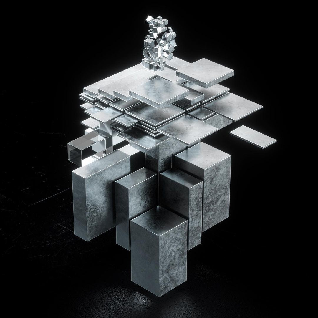
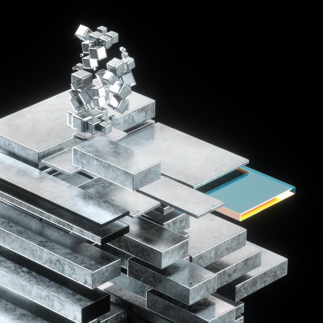
Some early sketches from the process


SCHEMA : DARK preroll video
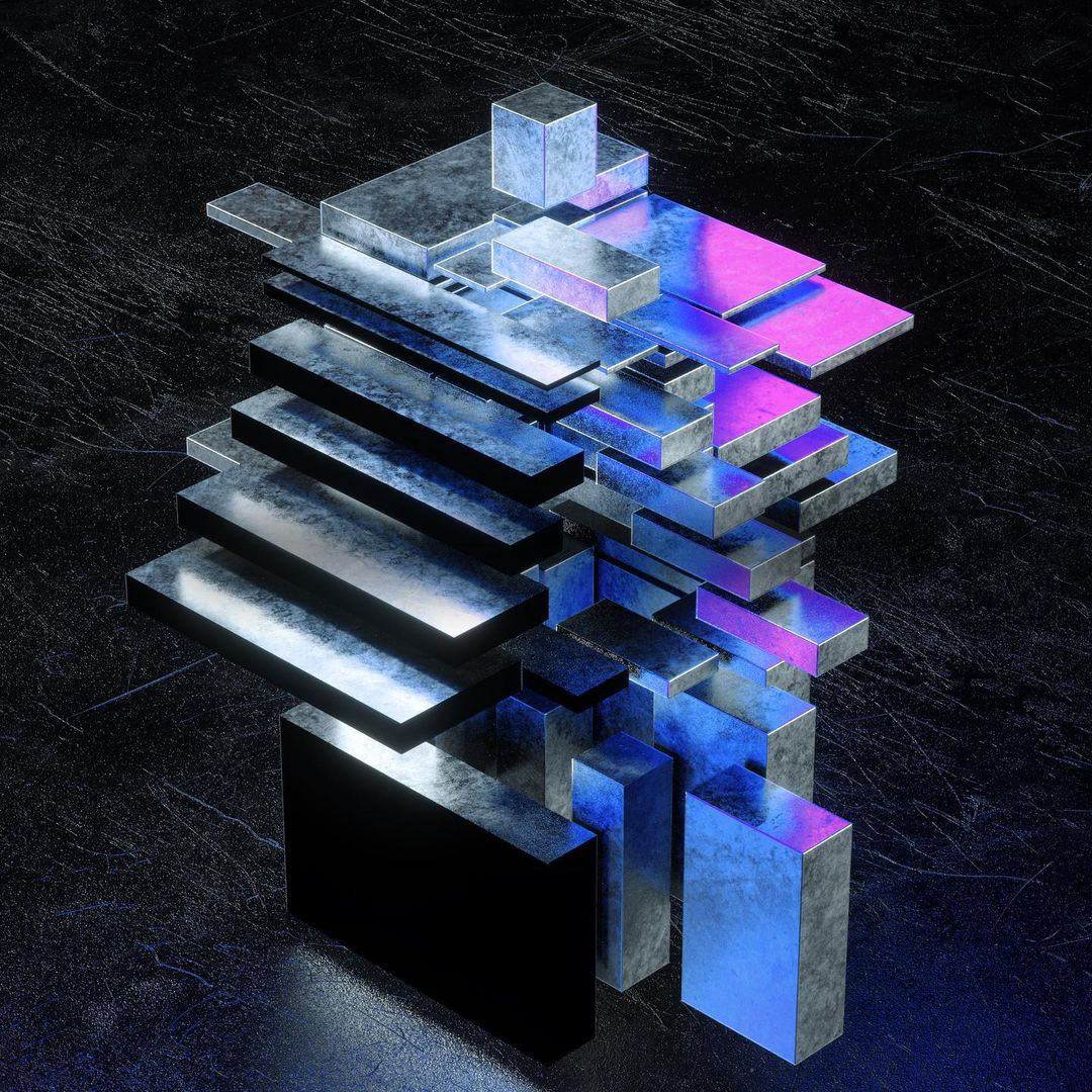
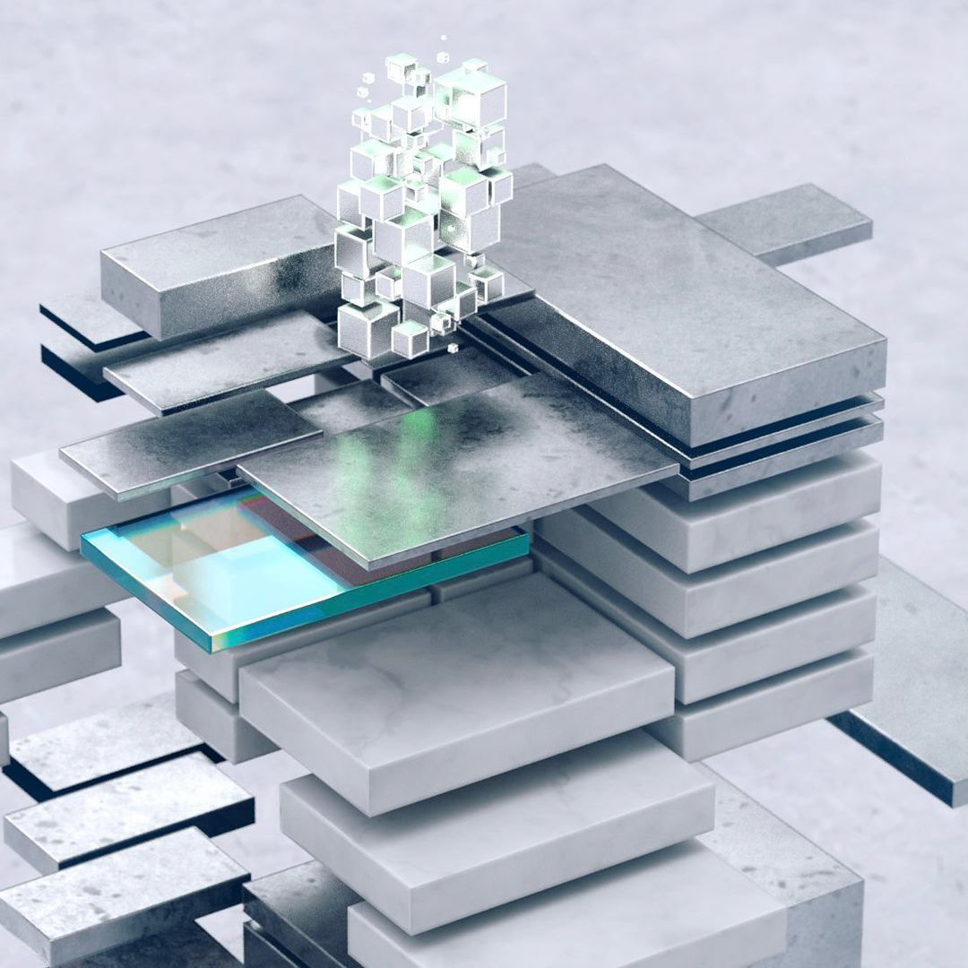
Schema Light and Schema Dark are sibling products designed to provide contrasting soundscapes: Schema Light offers a softer, more open experience, while Schema Dark brings a deeper, more intense atmosphere. My design approach highlighted this duality by giving each product its distinct visual identity—Schema Light with bright, airy tones and minimal elements, and Schema Dark with rich colors and stronger contrast. Together, they offer users two distinct yet complementary aesthetic options, each catering to different creative moods.
Some screen captures from the preroll video
